Whenever I have a bit more time on a pose (5 min or more), I try to add some tone to add volume and solidity to the pose. I try to spot and create large shapes and fill them, kinda like a “paint by number” exercise. This way , if the pose ends, I still have the info of where to complete the shadows. Try it out. -n
Here’s a technique I use often when attending life drawing sessions, especially nude sessions. I feel like it gives an energy and direction as well as clear volume to the figure. The more i know about underlying muscles, bones and general body structure, the more I can express through this technique. It’s kind of like a classic brush work when dealing with ink. It’s just more forgiving when using a Conte stick, by varying the angle and pressure of it.
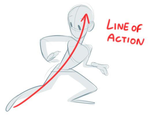
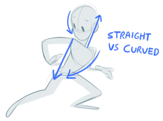
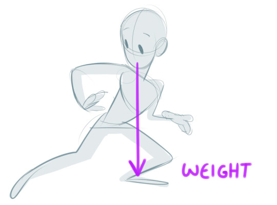
I guess three things I think of when it comes to poses are line of action, straight vs curved, and weight. I’ll use this quick awkward doodle to demonstrate:
You probably know this one if you know animation. Everything in the drawing doesn’t necessarily have to stick to it, but its a good basis for the overall silhouette. Most examples I’ve seen stick to one line, but sometimes I experiment with two if I’m going for a more action-y, dynamic pose. Its best not to go over two (two is risking it) as that would just get too visually confusing.
This one is more for smaller details, such as the arms and legs. Its good if you want to go for a more stylized look, since real life humans never have completely straight lines anywhere on their body. It’s basically contrasting a straight line with a curved one so you get a clearer idea of where the volume is going. Check out this video if you want more info, which is where I referenced from!
An easy one to forget in my experience. A little trick we learnt in life drawing class is that in real life the nose should generally be parallel to where the most weight is, to make it look more balanced. You’ll notice too that the body gets more compressed where the most weight is, ie the left leg here.
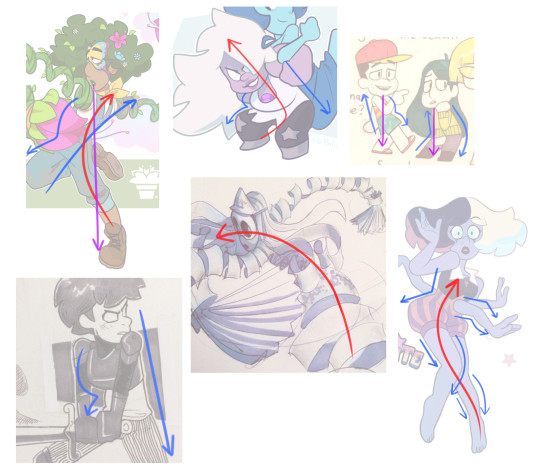
Some of my own (colour coded) examples, although I’m still learning to apply these things ~
(Sometimes if the nose doesn’t line up with where the body is leaning, you have to balance it out with the limbs or other body parts. The amethyst one would not work if she wasn’t holding another character on her back)
I recommend looking up these techniques online or in art books as you’re bound to find more in-depth tutorials and examples. But overall I hope this helps!
Tuesday Tips – A Matter Of Perspective: understanding the angle you’re drawing from means you can extrapolate the forms and sometimes exaggerate them. Think of your eye as a camera with a “fish-eye” lens, especially for a standing figure while you’re seating. -norm #grizandnorm #tuesdaytips #100tuesdaytips #amatterofperspective #figuredrawing #lifedrawing
I just sorta summarized it into pictures so you don’t have to go back and forth but i didn’t put the in depth meaning behind it so i still recommend checking the site out!!:
I’m only a self taught artist, no school or professional background so a huge disclaimer
I’m pretty sure most people knows the basics like neutral, primary, secondary and tertiary as well as subtractive primary colors (CMK) so I’ll skip through that along with the cold and warm colors:
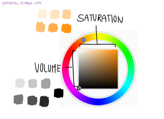
Volume and Saturation plays a big role on making palettes. It plays the part of the appeal and what colors to choose, palettes that are too saturated or high on contrast are quite painful to look at (some artist make it work by balancing it out so they still maintain the bright colors) and unsaturated, low on contrast palettes are dull to look at and not very a appealing.
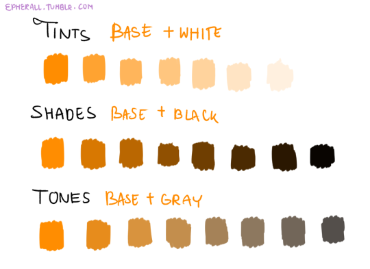
Tints, Shades, and Tones are sub terms you can use, this chart is to help you differentiate them
Now the fun part!!
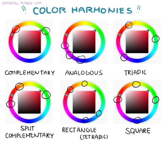
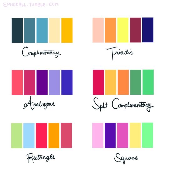
Color harmonies are basically techniques for choosing colors. Since SAI’s color wheel is kinda a disaster I recommend just looking up a color wheel on google or you can use this one here.