This goes along with my last post as an exercise that can be one from observation.
The steps explained briefly:
A. Draw in the big proportions with few lines. B. Draw in the basic shadow shapes, keeping the structure of the head in mind at all times. C. Establish big tonal relationships in the image. D. Bring in halftones to describe forms turning. E. Some extra information in the shadow. F. Modify edges throughout the picture.
A quick word on edges:
Edges and their variations are integral to creating a visual impression of the experience of seeing the world. The eye sees selectively and doesn’t observe everything around us with equal clarity. Edges in painting are not only the boundaries of one form, object or surface material to another, they occur on every side of every tonal shape. Like with tone, there is a range of edges to choose from, going from a total blur to razor sharp. Decisions must be made on the relative ‘softness’ or ‘hardness’ of these transitions to achieve a desired result. When working from observation, most of the answers can be found by observing and especially squinting at your subject. However in many cases it is appropriate to soften or harden an edge based on personal taste and compositional design choices.
Do you design a lot of characters living in not-modern eras and you’re tired of combing through google for the perfect outfit references? Well I got good news for you kiddo, this website has you covered! Originally @modmad made a post about it, but her link stopped working and I managed to fix it, so here’s a new post. Basically, this is a costume rental website for plays and stage shows and what not, they have outfits for several different decades from medieval to the 1980s. LOOK AT THIS SELECTION:
OPEN ANY CATEGORY AND OH LORDY–
There’s a lot of really specific stuff in here, I design a lot of 1930s characters for my ask blog and with more chapters on the way for the game it belongs to I’m gonna be designing more, and this website is going to be an invaluable reference. I hope this can be useful to my other fellow artists as well! 🙂
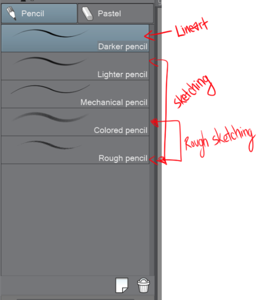
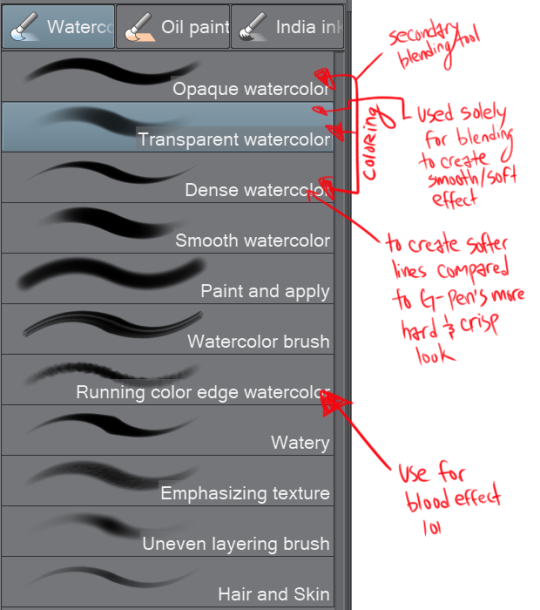
For digital??? lmaoo I mean I just use the default tools in Clip Studio Paint! LMAO I’m too lazy to create my own brushes or to look up different premade brushes so I just make do with what I have! But if you want specifics–
I don’t use SAI to paint so I don’t really have settings as such – sorry! – but I’ll leave a link below to the brush pack that I use on CSP.
What I do is line-art, cell shading and before I paint over that I like to set a multiply layer of bright yellow/orange on a lowish opacity over the cell colours. It tends to make colours warmer and more saturated, and combined with bright blue/purple on a second multiply layer for the shadows, it makes the picture pop!
Line-art/sketches don’t have to look great as long as they’re clean and have clear shadows and colour control. I pretty much just add a bunch of multiply layers to the cell colours and just paint straight from that. Don’t feel too locked into the original sketch! I just paint straight on top of everything.
The main brush I use to paint with is the flat brush from this wonderful brush pack by MagdaPROski on deviantart – I also use the hairy brush from it for line art. If you don’t have CSP then I totally recommend that you get it, it’s easily on par with photoshop when it comes to digital painting!
Sorry it took me a while to reply to this! I like to ramble and I went into more detail than I thought I would. Hope this helped anyway!